What’s in a Name?
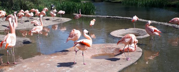
I am frequently asked where the name Fuzzy Flamingo came from, especially since business branding and logo design have become an important part of my business. I have loved nature ever since I can remember; I have a few favourite animals, including sea cucumbers, axolotls and naked mole-rats (okay, so maybe a love of slightly odd animals; I like to call them ‘quirky’, my husband calls them ugly!), but top of the bird list is the flamingo, closely followed by the curlew (a water bird with an incredibly long curved beak). The obsession began when I got hooked on playing the computer game The Sims as a young child, which is perhaps where the passion for design also blossomed! I’d spend hours designing intricate homes for my families of all different shapes and sizes, but the common thread linking them all was the humble plastic flamingo that I had to have in every garden. And I now have one of these (an authentic American one!), plus some beautiful metal flamingos flourishing in my own garden; you can see them on my Instagram page! How many do you think I need to have before they’re classed as a ‘flamboyance’ (the name for a group of flamingos)? This grew into a full-blown passion project of research because I had to know everything about them, where they live (amongst other places the Caribbean and South America), how many species there are (six), why they stand on one leg (because if they didn’t stand on any they’d fall over) and how they breed (with a good sense of balance!) to name a few questions. In the days before internet search engines and broadband I loved the library and encyclopaedias and spent hours reading about these magnificent birds; so, they may have also sparked my love of books. Flamingos have been such a huge passion throughout my life, sparking other passions that have filled my career.
Naming my brand
Growing up, I have always strived to stand out from the crowd, which is important in design: it needs to be noticed, but for the right reasons. The phrase “be a flamingo in a flock of pigeons” therefore speaks volumes to me. Good design should catch your eye and make you take a second look. It should show you what the message is, whether it is the genre of the book, the nature of the event or the type of business you are showcasing, but it should also be different enough to be seen above all others. This is a difficult balancing act, rather like standing on one leg! Flamingo species look really different to each other; have a look at the James’s versus the American, it really stands out. However, if you look at any of the species you will instantly know it is a type of flamingo. An example in terms of design is knowing that the cover you are looking at on the book you have picked up is your favourite genre, but it stood out enough for you to pick it up and read the blurb above all others on the same shelf. Likewise, the same is true for book writing, it should be recognisable as a certain genre, whilst also being different enough to keep the reader’s interest and get recommended. A difficult balancing act, right? Well, balancing just happens to be the speciality of the flamingo, so they speak to me on both sides of my business, design and editing.
Where did the initial concept for my business begin? My background is in book publishing. Books have always been a huge part of my life, both fiction and non-fiction, so when a job came up locally in that industry, for a company that published all genres, I jumped at the chance! I worked my way up through the production side of the company, having started picking and packing the book orders in the warehouse, and ended my time there as Group Production Manager, overseeing a pretty large team designing the text and cover for every book published under all of the publishing imprints. This is where my graphic design skills were trained, developed and mastered. From there, I branched out, designing logos and marketing materials for businesses, as well as lots of other design projects. The editorial side started by working as a copyeditor and proofreader on a freelance basis alongside my full-time publishing career. This gained me a lot of experience and honed my skills (pedantism is my middle name!). When I had my daughter at the end of 2016 I enjoyed my time with her so much that going back to my full-time publishing job wasn’t practical or as desirable anymore, and so with the amazing support of my employer I decided to try my hand at full-time freelancing. Thus, Fuzzy Flamingo was born, first with editing from September 2017, then with the launch of the design side in January 2018. In the last year, my company has grown considerably, which has led me here to writing this blog.
Building your brand
So, why am I telling you all about my company’s pink-feathered foundations, and how is this relevant to you? Well, it’s all about branding. Something I regularly hear from my logo design clients is ‘I don’t know if prospective clients will know what my company does’. Well, as with a book cover not telling the whole story, a logo doesn’t necessarily have to directly explain what your company does. Just have a look at successful brands around you. Does McDonalds have anything related to food in their logo? Does Apple have anything to do with computing in their image? It is more important for your logo to represent you, as you are the most important part of your brand.
Logo design: fitting with your brand
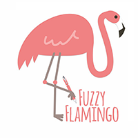
Although the pen in my logo links together both the editorial and design sides of my company, it is a tiny detail that goes unnoticed by most. The more important aspect is the flamingo, which, for all the reasons I’ve given, represents me and the foundations of my brand. I know it works because I get tagged in no end of flamingo products on social media (which never gets old, by the way, so continue to tag away!). I am also fortunate that not long after naming my company, a deluge of flamingo products hit the retailers’ shelves and have remained there for the last year. Plus, many people have said that they can’t see flamingos without thinking of me and my company. It is a clear, recognisable image that works well for me and my brand and stands out from the crowd. It uses only two colours that can then be rolled out across all of my branding, such as my marketing materials (business cards, flyers, etc.) and my social media marketing (primarily Facebook and Instagram), plus the company name and font complements it well and uses one of those colours.
Whether it is a book cover you are branding, maybe it is the first in a series and you are planning more that will need to complement it and sit well with it on a bookshelf, or it is your company that you are branding, there are lots of hints and tips I can give you that will need to wait for another post. Most important, however, is keeping it simple and ensuring it sits well with you and your passion. Remember that you are your brand, you need to smile every time you see your logo and you need to be a Fuzzy Flamingo in a flock of pigeons.
